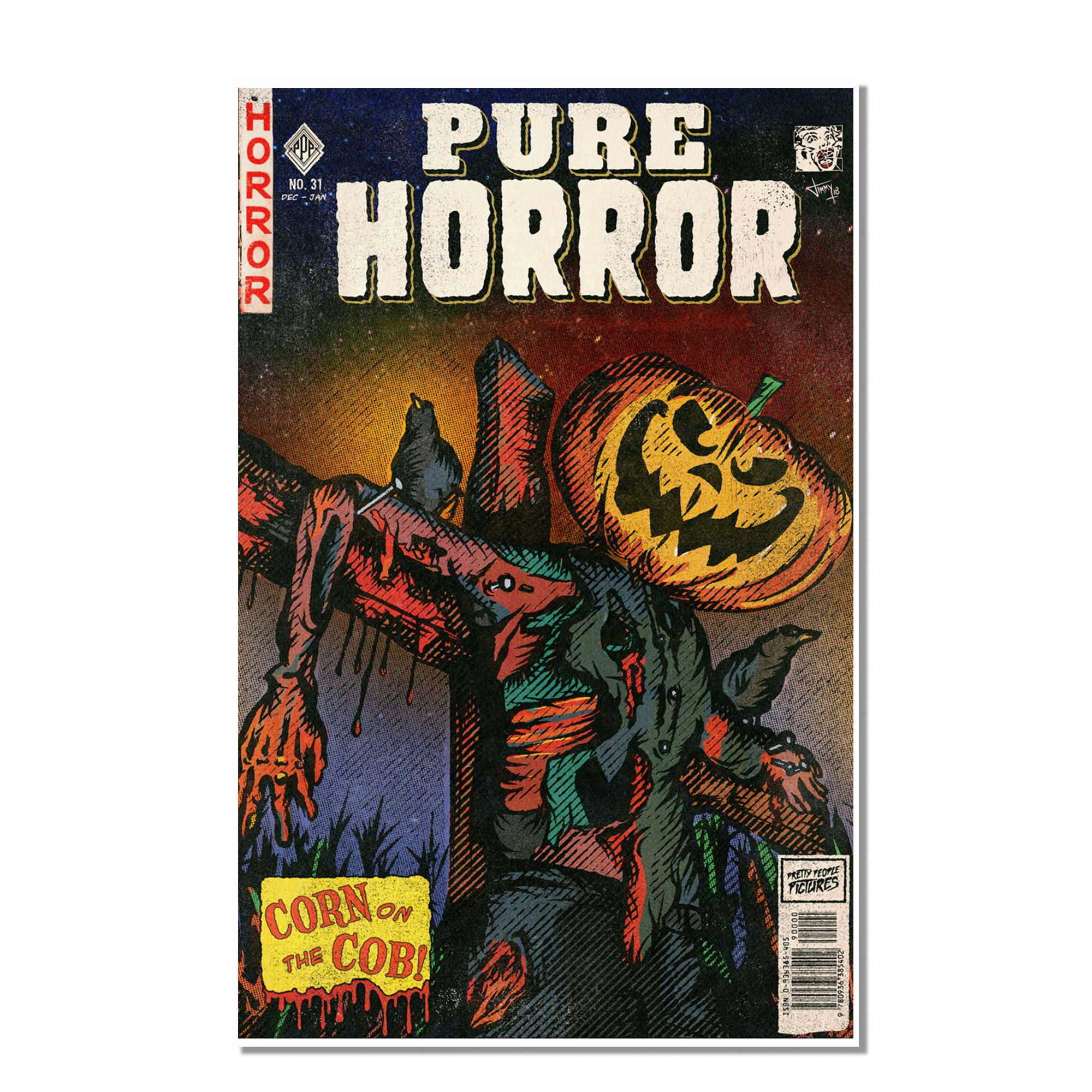
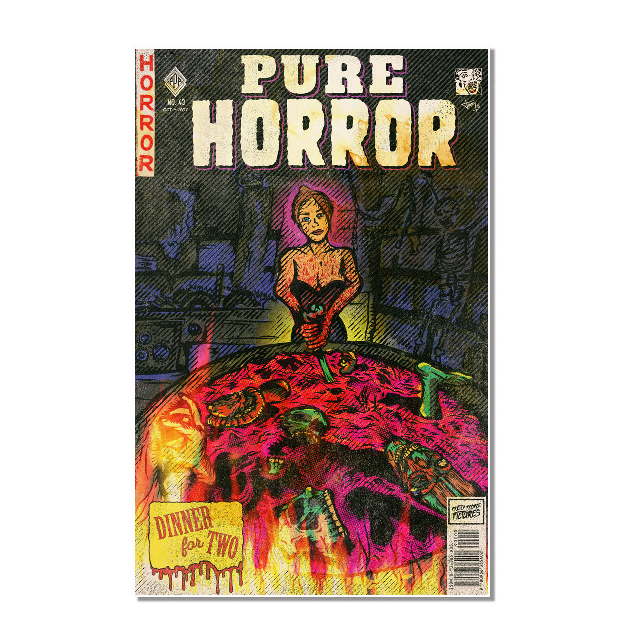
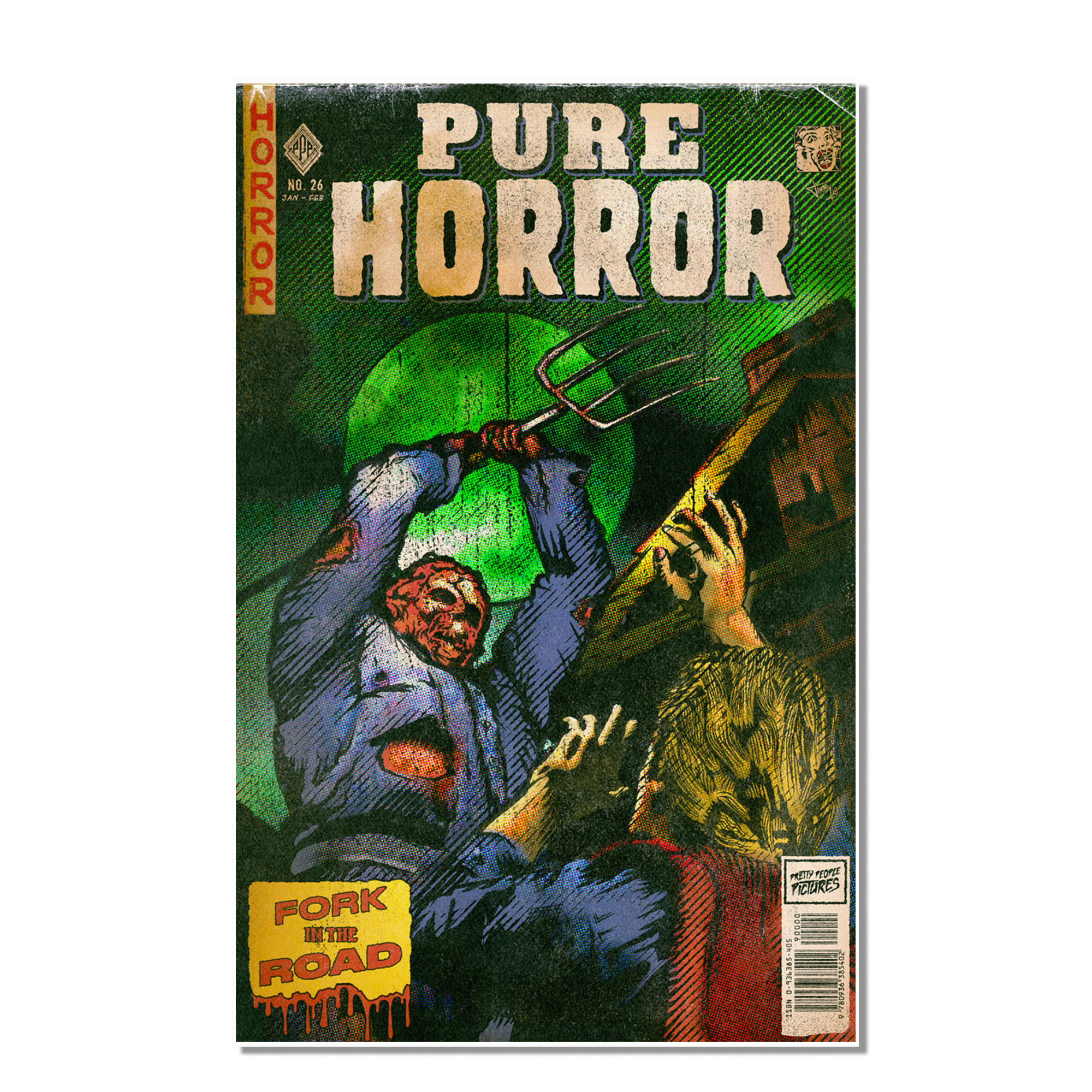
In October 2018, I illustrated the cover of a made-up horror comic inspired by vintage comics of the 1950s and 60’s.
What started out as a simple test to explore some new software quickly turned into a new passion project: Pure Horror
I DON’T Know how to DRAW
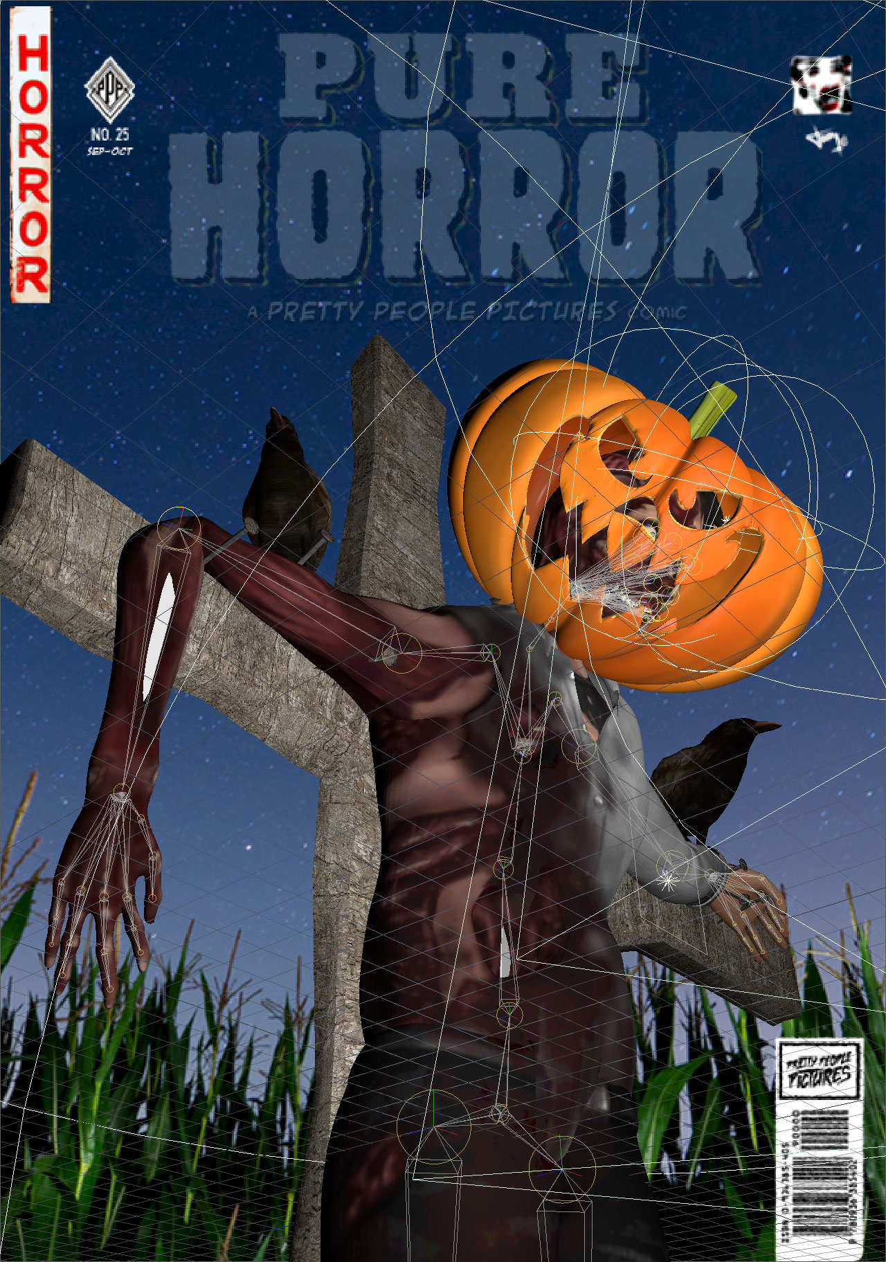
You know when a professional artist draws and they start with what looks like a series of faded, crappy circles and eventually transforms that into the most beautiful portrait of a person you’ve ever seen? Yeah … I can’t do that. I mean, I can try, but it usually looks really bad. I like illustrating directly on top of my reference. It’s fun, meditative, and a craft in and of itself. The problem is, you’re limited to only the resources you can find. With my background in 3D animation, I thought “Why don’t I just create my own references?”
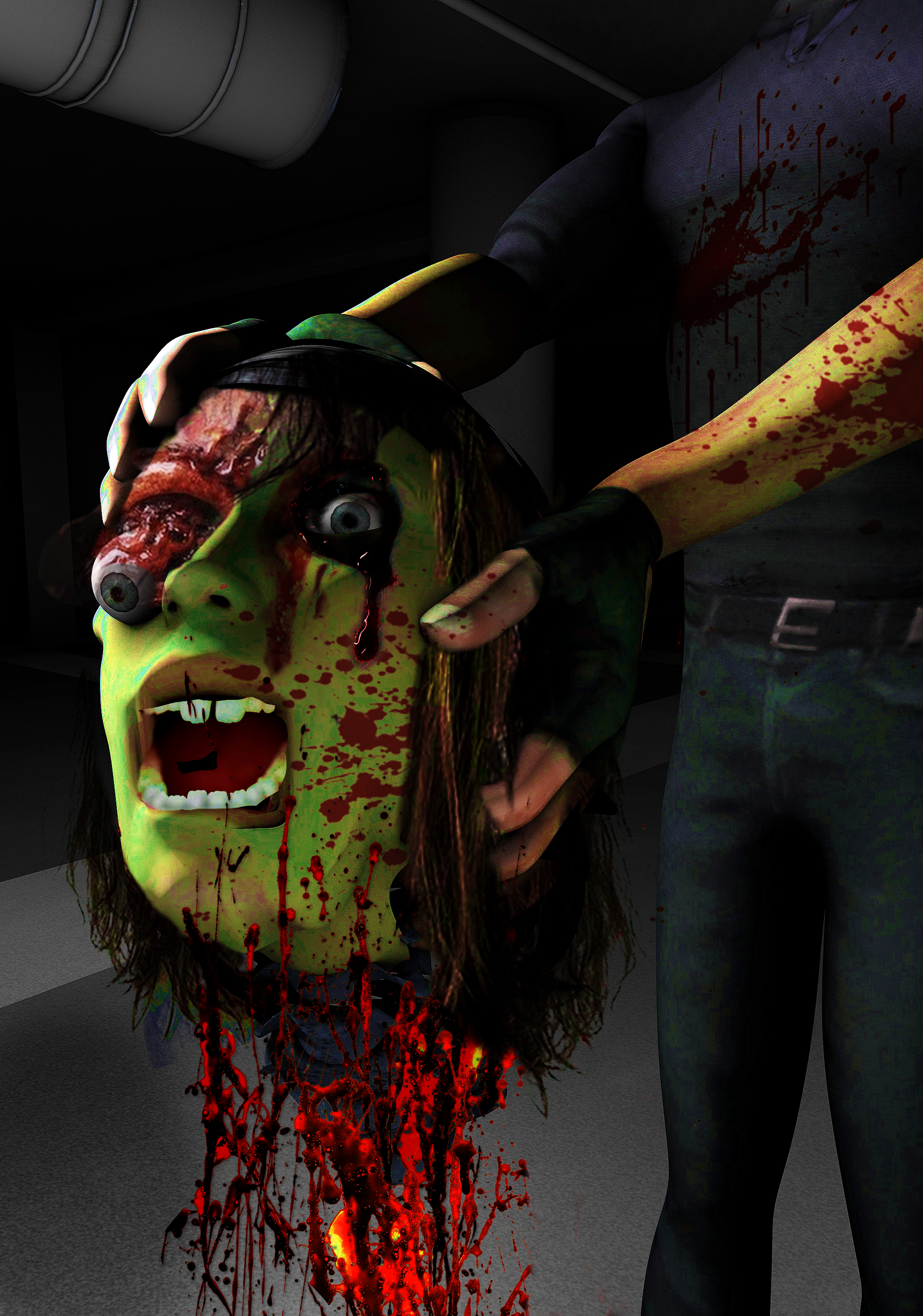
Using Cinema 4D, my personal library of 3D models, textures, shaders, light rigs, etc. and online resources like Turbosquid and CGTrader, I quickly realized I could create anything within my imagination. So naturally, I started creating a bunch of spooky and gory vintage comic book covers. At first, the goal was to create a full blown comic book, but creating the illusion of an entire story with just one image has been more fun and rewarding.
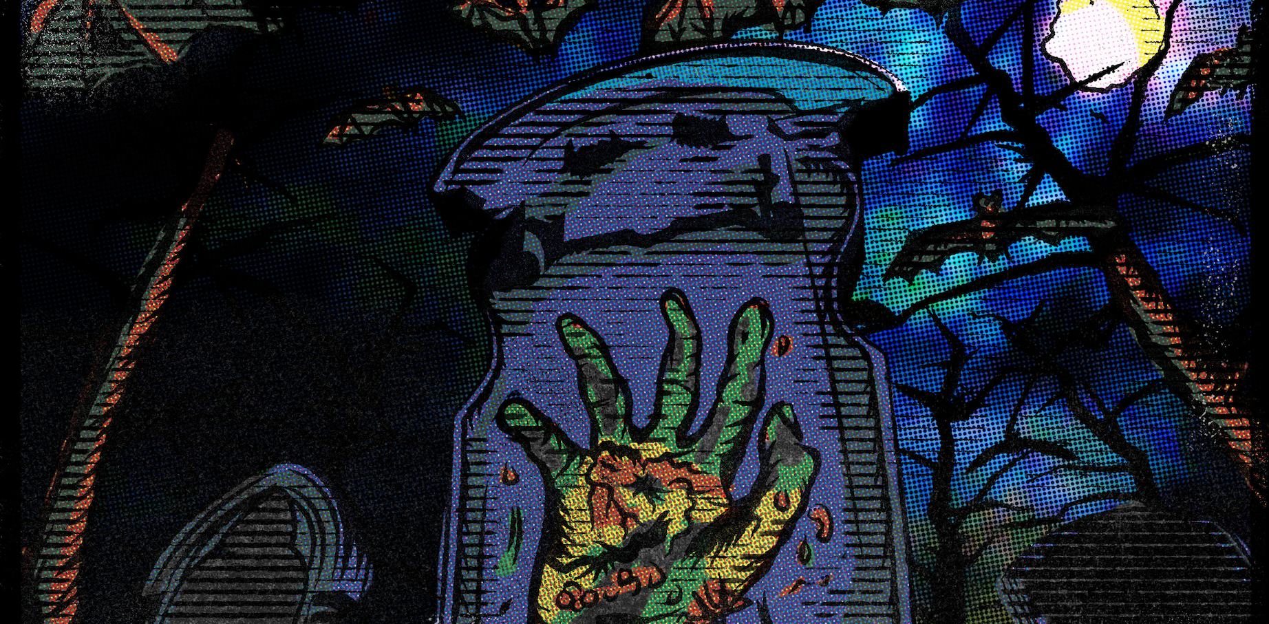
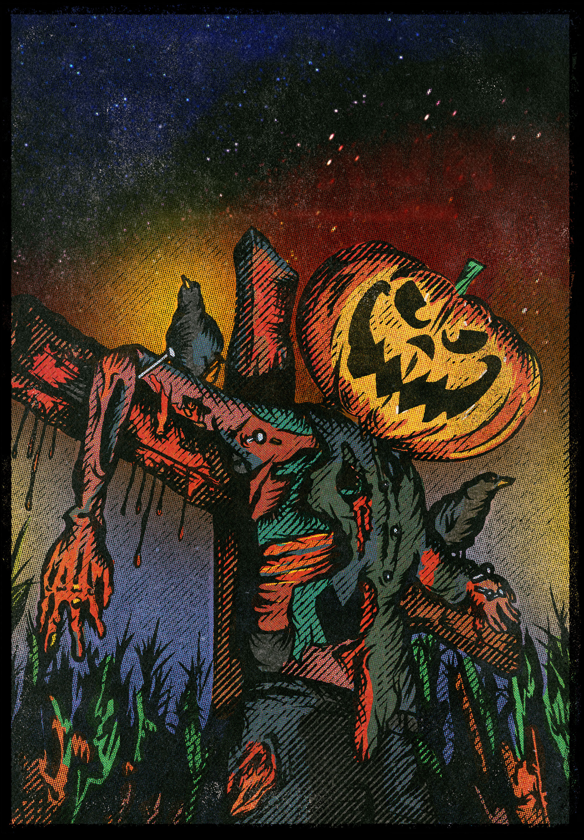
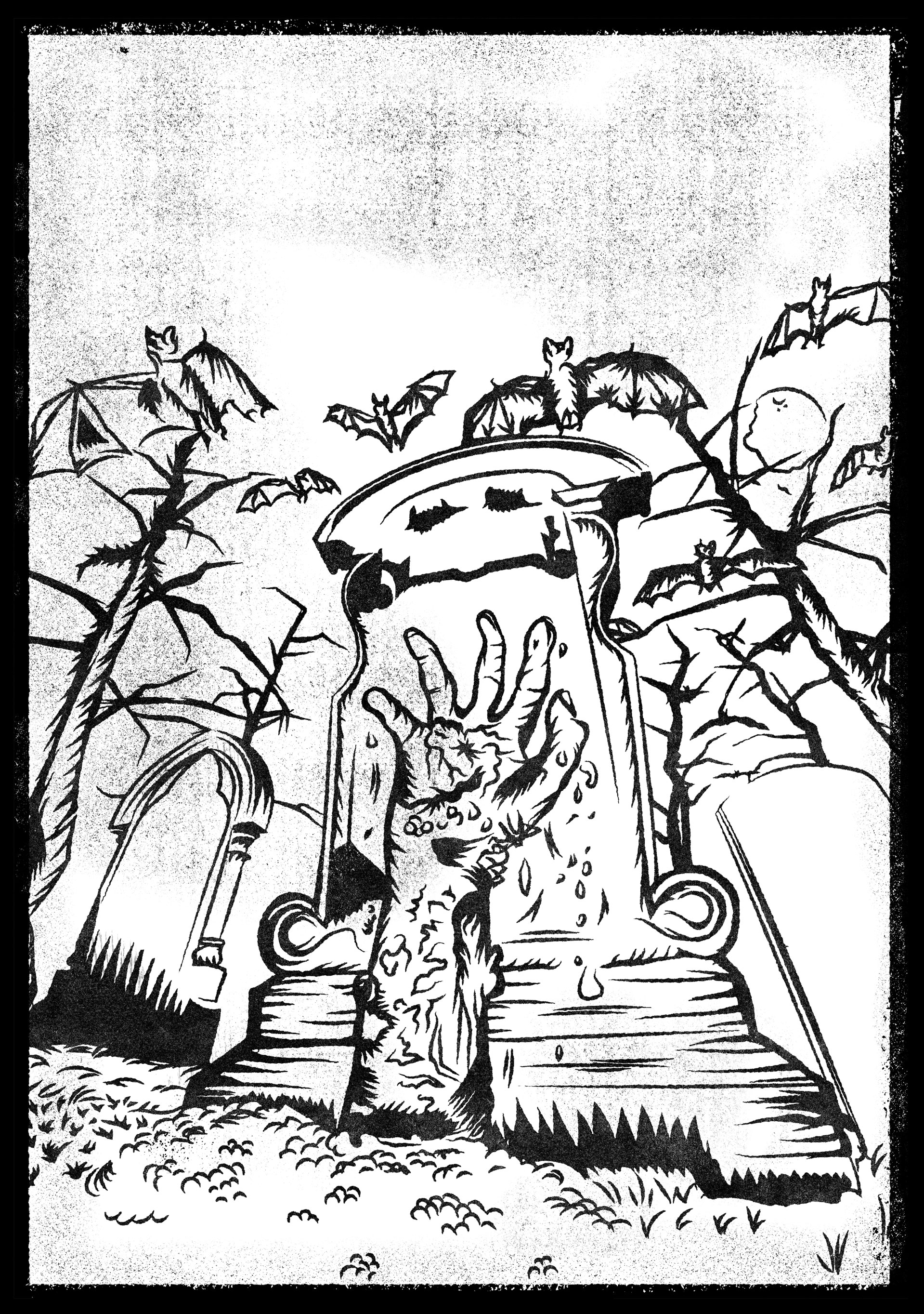
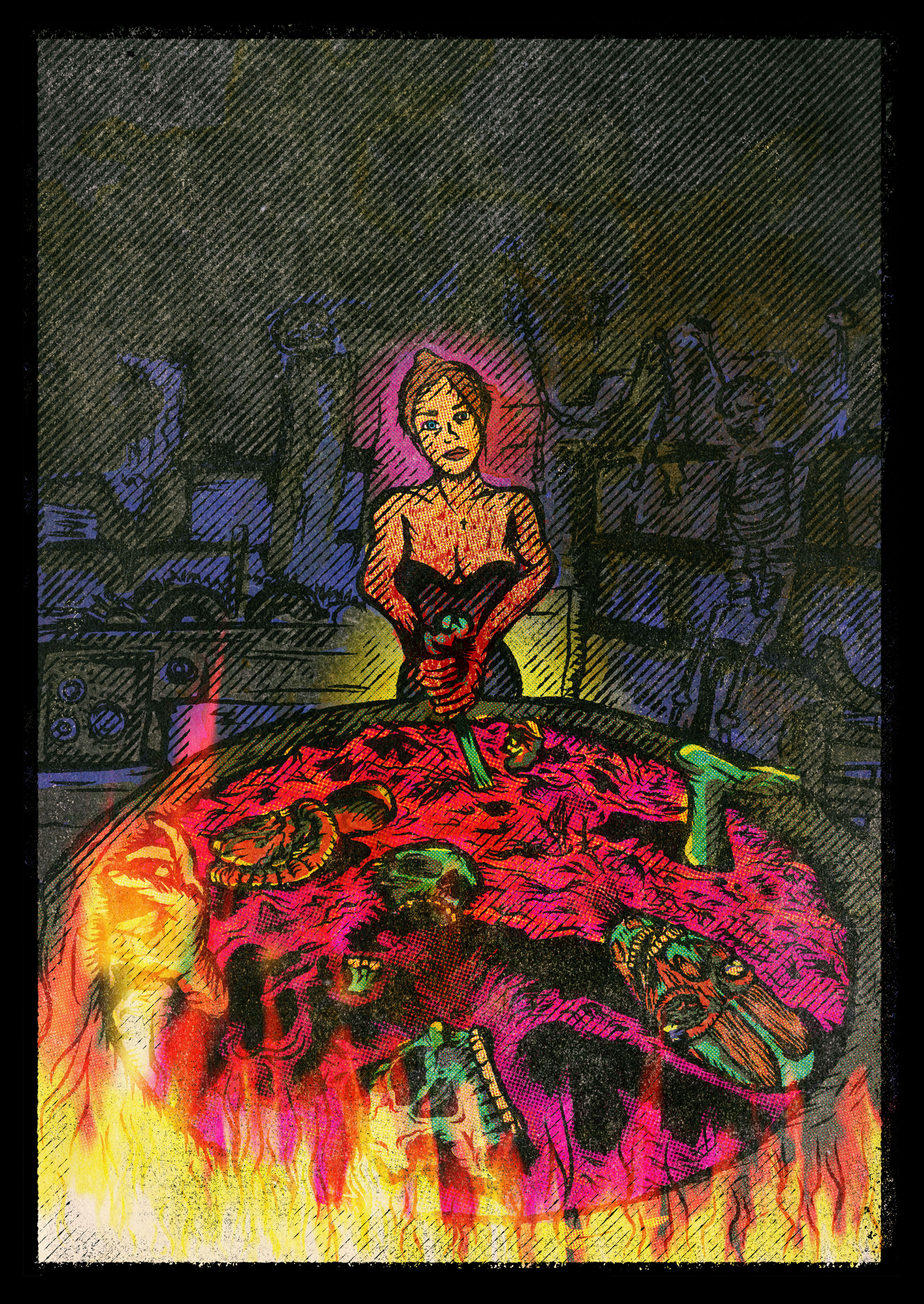
The cool thing about this project is each “cover” creates three distinct pieces of art. The 3D reference image, key line art, and final image.
Each piece starts out in Cinema 4D where I build the scene and compose the shot. I’ll render that out and bring it into Adobe Illustrator where I draw the keyline art. From there, I put it into Photoshop and “beat it up” using various tools and third party plugins. Once it’s done in Photoshop, I add the text and viola!
