
God Signs
About the Project
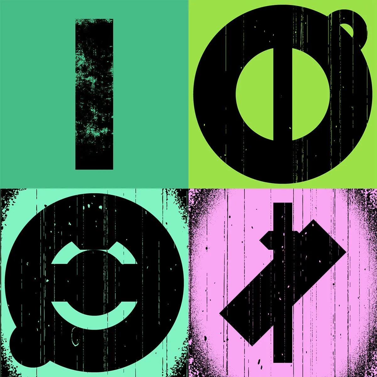
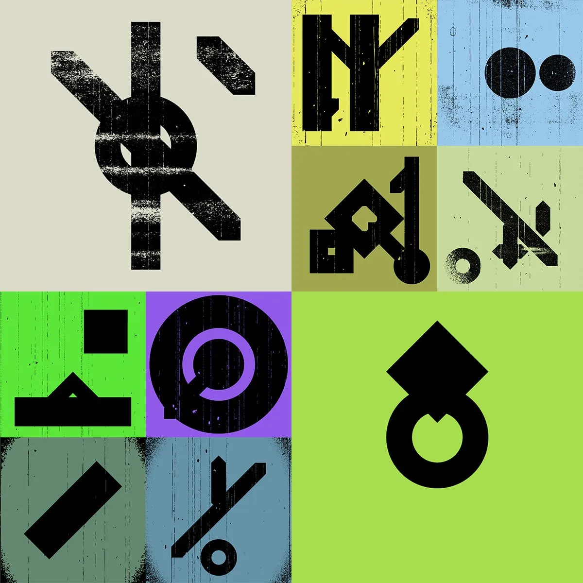
"God Signs" is an enthralling digital art series that delves deep into the essence of iconography, dissecting the visual language that shapes our world. Each generative piece emerges from a meticulously crafted p5.js algorithm, striking a harmonious balance between precision and chaos. The visuals resonate with the ubiquitous symbols that permeate our lives, from the sacred halls of religious institutions to the sleek branding of corporate behemoths.
This series speaks to the universality of design, the shared geometries, and forms that have been a cornerstone of human expression from time immemorial. The work suggests that the symbols representing the most countercultural movements are not so different from those of established power structures; they all draw from the same well of visual communication. The grunginess and erosion of each piece not only signify the ancient, weathered use of these symbols but also conjure the replicated nature of communication, reminiscent of photocopies and print presses that have perpetuated these icons across time. "God Signs" is a dialogue about the power of symbols, their role in society, and how they can be both revered and repurposed.
Inspiration
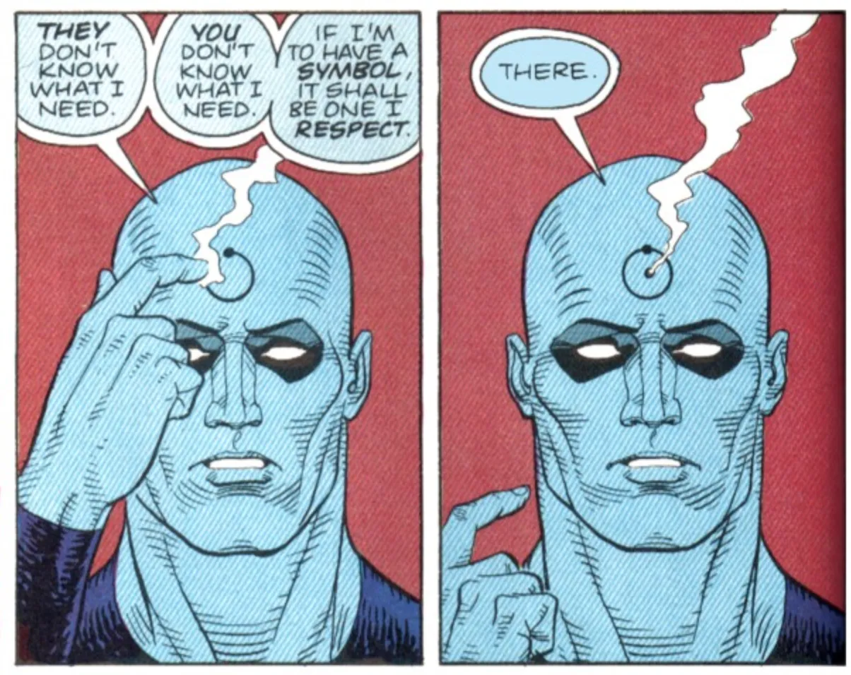
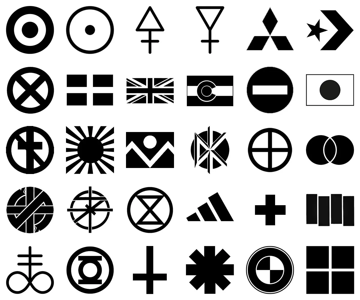
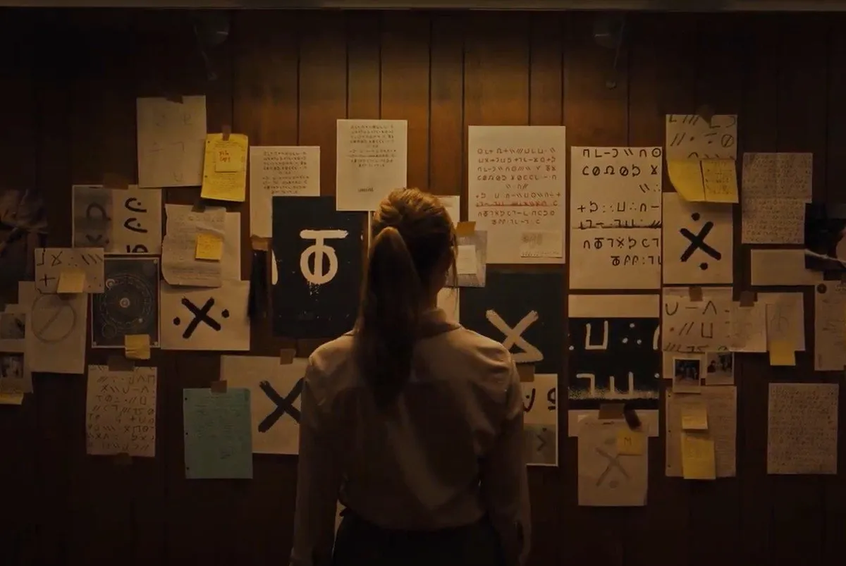
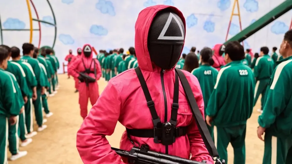
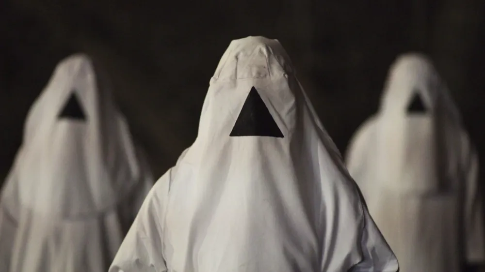
Like any designer, I’ve always been incredibly curious about iconography. It fascinates me that the same four or five primary shapes can mean so many different things to so many different people, globally, and throughout history. For example, how two rectangles intersect with each other can represent a religion, the martyrdom of an apostle of that religion, an anti-religion, a country, a humanitarian organization, “in addition to…”, the sun, health, “No!”, or a group of superhero mutants. Four black bars represent one of the most renowned anti-corporate, DIY, counter-culture hardcore bands of all-time while four boxes represent the largest, wealthiest, and most powerful corporation in the history of the world. The most simple collection of shapes can mean anything from love or hate, hope or fear, countries or states, Adidas or Converse, Crass or Red Hot Chili Peppers. It will forever be mind boggling to me.
Since all of these icons and symbols are so simple in concept yet so powerful when properly executed, I wanted to create a program that could generate these with the click of button.
So I did.
Building the Project
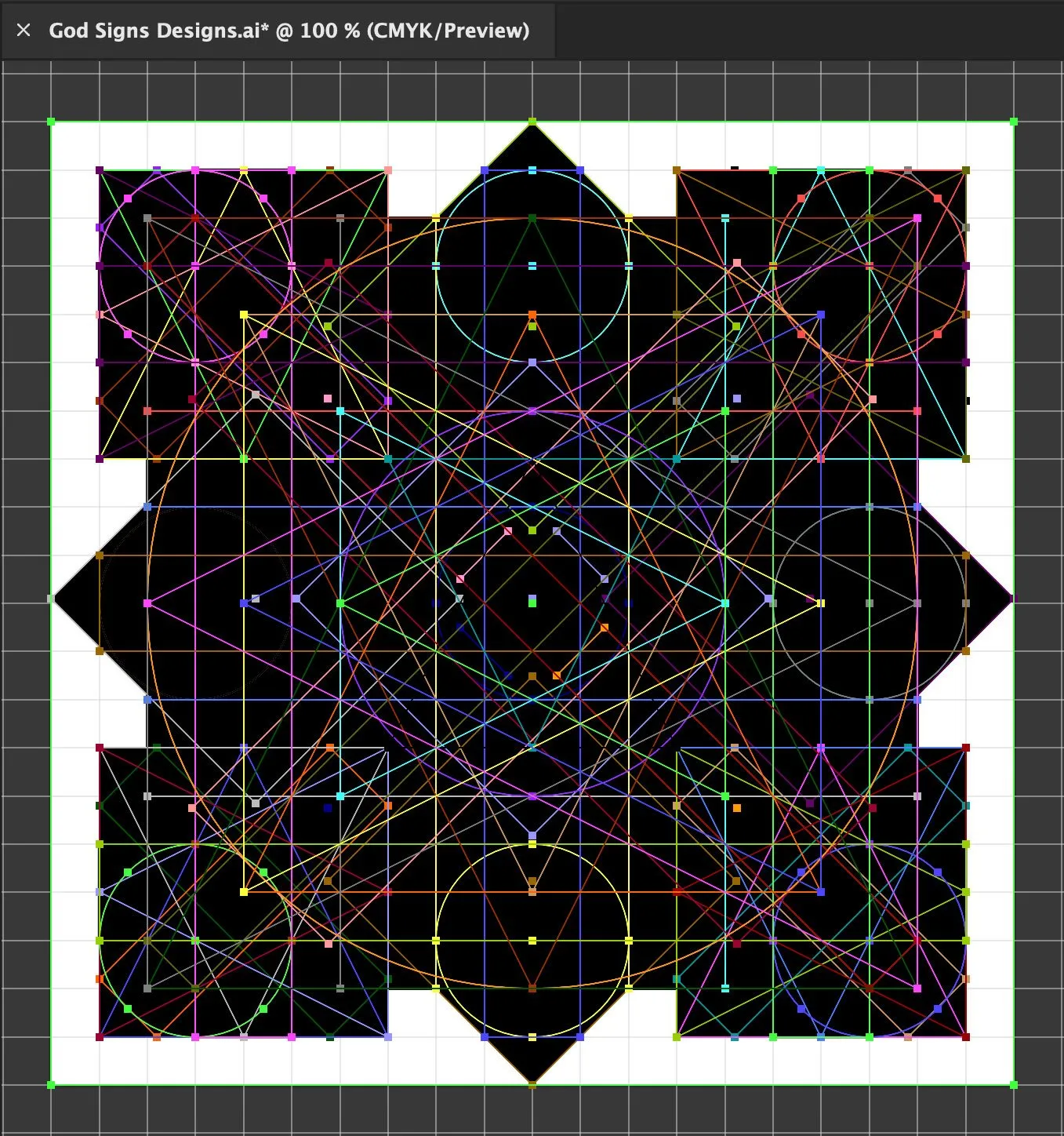
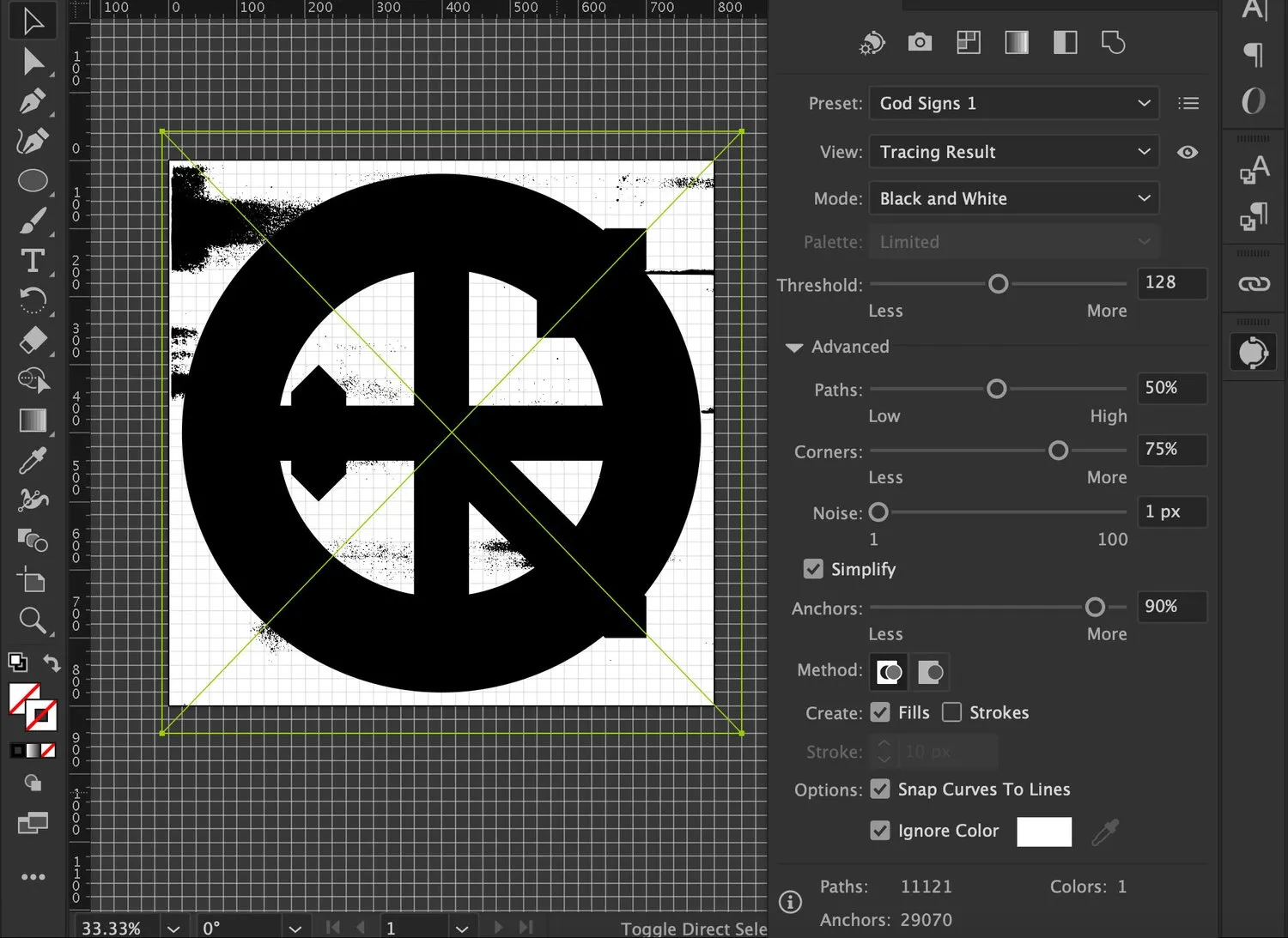
99.9% of this project was spent designing, redesigning, fixing, and then re-fixing these goddamned “God Signs” elements. Here’s the deal, I have no doubt there is a (probably relatively simple, especially with ChatGPT) way to do this programmatically, all within p5.js without ever opening Adobe Illustrator. But I didn’t have this whole thing planned out before I started it, so it organically evolved into what it is now which means there was a bit of a messy trail left behind.
It started as 400 x 400 in size but halfway through, I wanted to double the size for numerous reasons. When I rescaled everything I had built, for some reason I still can’t figure out (so it was probably just dumb user error), some of the elements didn’t resize properly while others worked great. At some point deep in the project, I realized about half of the elements had 1px strokes, while others didn’t while others were 80px stroke objects. Yeesh. It was a mess.
At first, I would design an element and then check it with all of the others to make sure they all fit together. But once I had a few dozen elements created, it was easier to just build the code at that point and then use it to test outputs. And boy DID I!
For a week, I rendered dozens and dozens of “God Signs” and saved any that looked weird and not cool. I saved adding grunge for the very end because I knew that would be easy and fun (and it was!). However, I went through 19 different testing iterations before I was happy with the program. It was a pain in the ass, but I love the results.
God’s Code
The code for “God Signs” is quite simple. In the NFT world, they called these “layered PNG” projects. Because the very nature of the project is essentially commenting on the simplicity of iconographic design, I felt it was fitting to have a simple code for the series. No rarity weights. No indexes. You run the program and a cool symbol is generated. If you like it, you press “s” and it saves to your computer. That’s it.
But this was not a “simple” code by any means. First off, the “erosion” and “grunge” can be finally tuned before the program is run. The logos can be clean and crisp, stylishly worn, or down-right unrecognizable. You can have up to 150 layers of “grunge.” You can adjust the black toner or color toner. Users choice. It’s not like beating up an image is a difficult thing to do, but I’ve been making flyers for punk bands and horror movie posters since I was 15 and have this shit down to a science. So believe me when I tell you this is some fine vector grunge work that makes for really cool results.
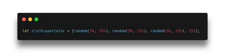
The vibrant color palette is thanks to ChatGPT 4.0. Keeping with the theme of the project, it’s a simple code. But colors can be kind of tricky in p5.js so here it is below for anyone interested.
Erosion
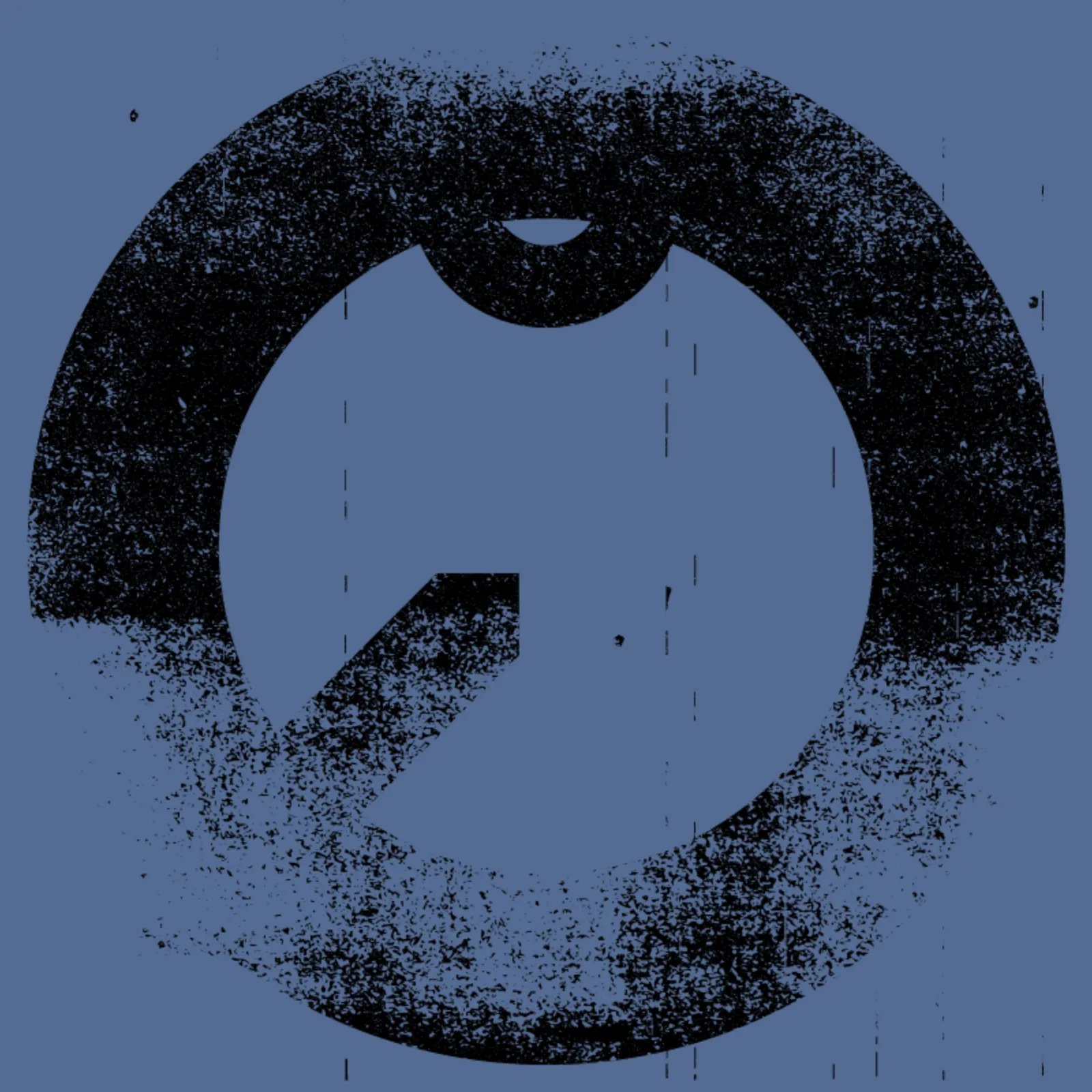
There are 75 grunge layers in the project (Black Toner). However, all were duplicated and converted to white (Color Toner). So that gives us a whopping total of 150 grunge layers possible for each render. Depending on what you need, you can adjust the erosion as necessary. Need a crisp shoe company logo? Turn down the numbers! You want the faded symbol of long lost revolution? Turn up the numbers. It’s fun!
Here are some examples below.
b = number of black toner layers
c = number of color toner layers
+-+b0+c0.webp)
+-+b1+c0.webp)
+-+b2+c0.webp)
-+b5+c0.webp)
+-+b10+c0.webp)
+-+b75+c0.webp)
-+b0+c1.webp)
+-+b0+c2.webp)
+-+b0+c5.webp)
+-+b0+c75.webp)
+-+b2+c2.webp)
+-+b5+c5.webp)
+-+b10+c+5.webp)
+-+b10+c10.webp)
+-+b20+c20.webp)
+-+b25+c25.webp)
+-+b37+c37.webp)
+-b75+c37.webp)
More Outputs Below
.webp)
.webp)
.webp)
.webp)
.webp)
.webp)
.webp)
.webp)
.webp)
.webp)
.webp)
.webp)
.webp)
.webp)
.webp)
.webp)
.webp)
.webp)
.webp)
.webp)
.webp)
.webp)
.webp)
.webp)
.webp)
.webp)
.webp)
.webp)
.webp)
.webp)
.webp)
.webp)
.webp)
.webp)
.webp)
.webp)
.webp)
.webp)
.webp)
.webp)
.webp)
.webp)
.webp)
.webp)
.webp)
.webp)
.webp)